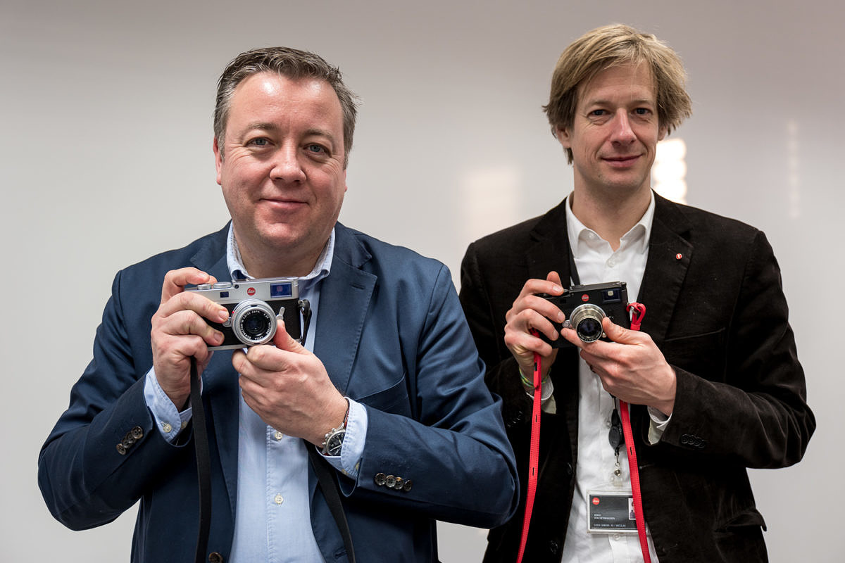
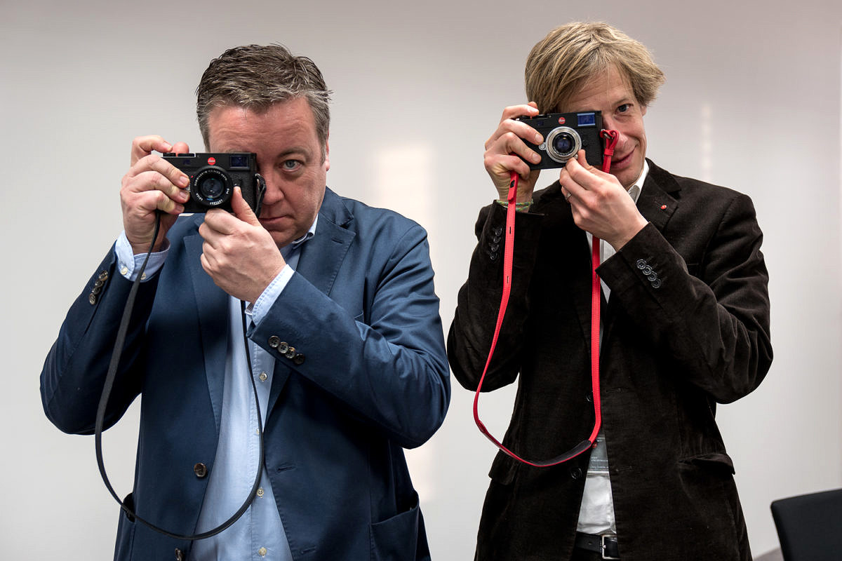
While I was in Germany for the Celebration of Photography Event a.k.a The M10 Launch, I had a chance to sit down for a chat with Jesko von Oeyhausen, product manager for the Leica M10, and Stefan Daniel, Global Director of Business Unit Photo. I've known both Jesko and Stefan for many years now, so I thought my readers might find it interesting if I published our full discussion, rather than the conventional and more formal Q & A. Fair warning: this is fairly long. But, if you want to get some insight into the M10 beyond the typical interview, give it a go.
First off, let’s get the obvious question out of the way. Why M10 and not M11? Or, why not M (Typ XYZ)?
Stefan: The reason we skipped the Typ number thing is that initially the goal was to call it a Leica M so that people would just talk about the M. On the other hand, somehow the products need to be differentiated, so the idea was to add the Typ number but not make it as prominent as it became in real life.
You mean that everyone now refers to it as an M240?
Stefan: So the Typ number, which was not intended to be part of product name, became part of the product name. Even worse, it got simplified from M (Typ 240) into M240 and this was not the initial goal. And also, the Typ numbers got confusing: 246, 262, 240. So, we’re back to the classic numbering. And M10 because we had to make a decision one day whether it’s the M10 or the M11. Honestly, this was really random.
M10 sounds good.
Jesko: Yeah. Why skip it?
Of the top features and improvements on the M10, which are you most proud of?
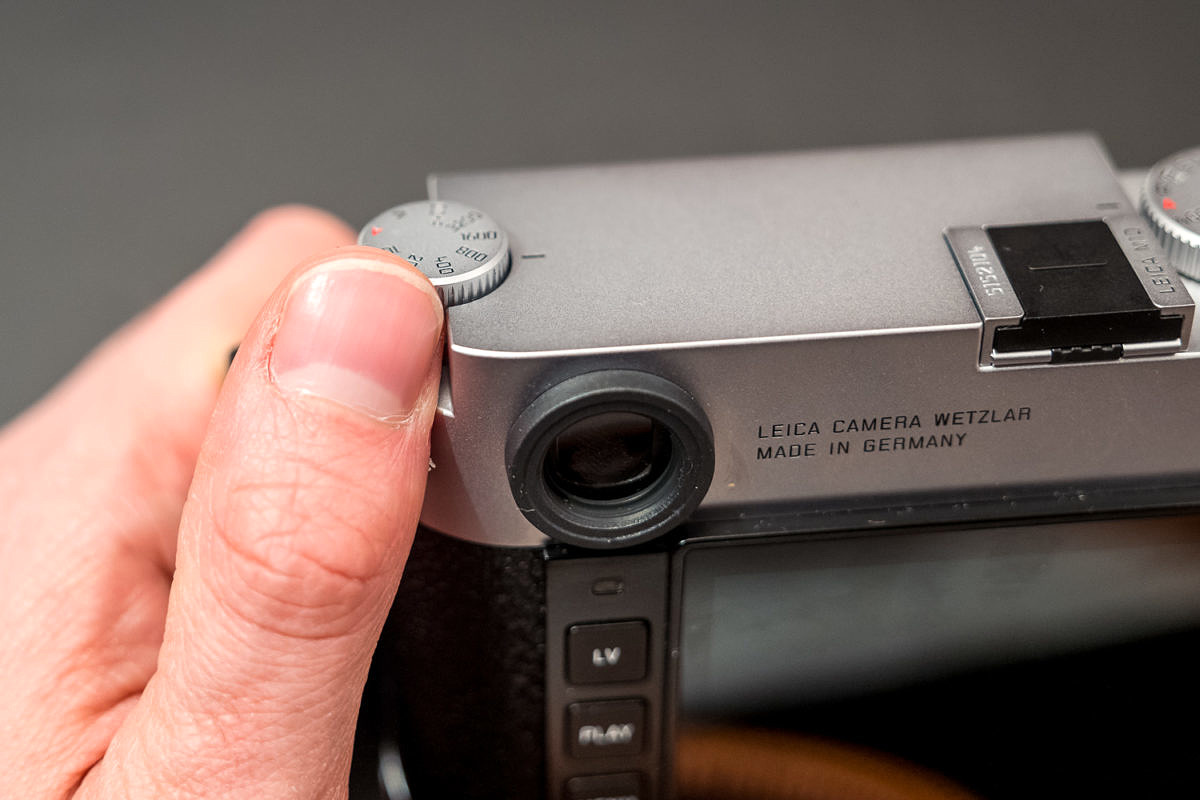
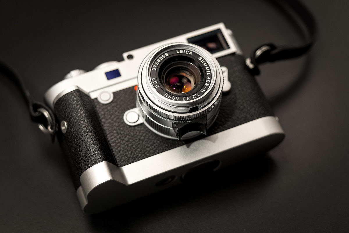
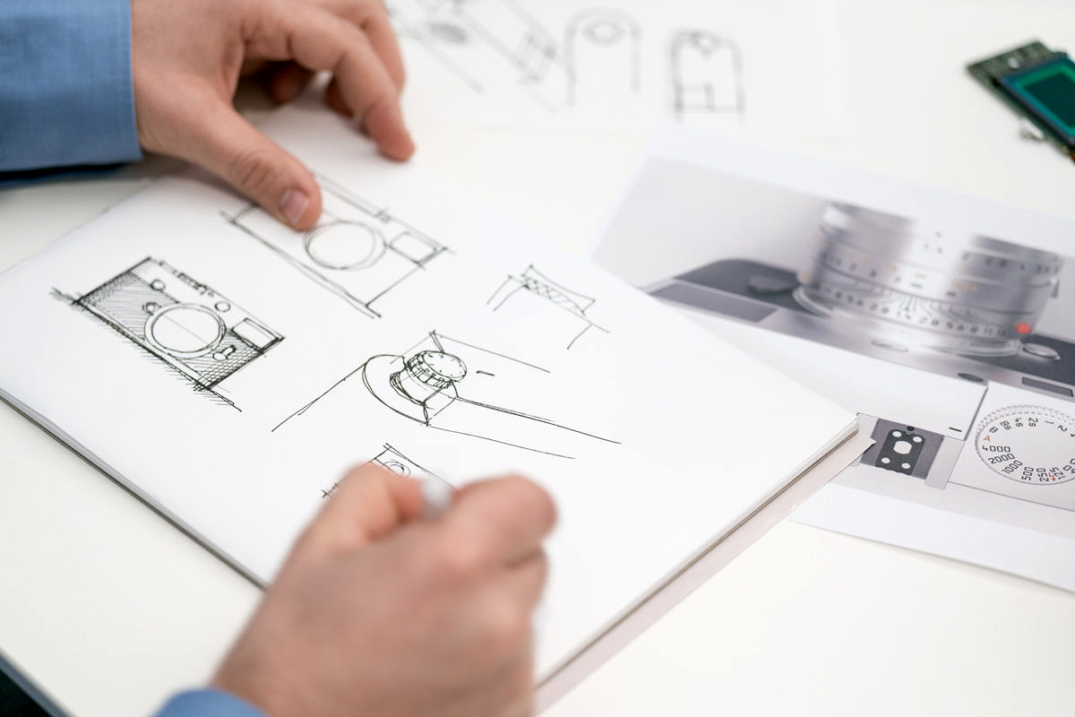
Stefan: I don’t think it can be reduced to a single feature, but we’re convinced that it’s the sum of the changes and improvements which make the camera so unique. Of course, there is the slimmer body which is the most noticeable. A 4mm reduction doesn’t sound like a lot, but it absolutely feels much smaller. We are very pleased with the result.
I’d say the M10 feels very much like an analog M.
Stefan: That was what everybody was wishing for and when we asked customers they were saying, “Can you make it just a little bit thinner? We know it’s difficult to go to the analog size, but please make it slimmer.” Especially those who are used to analog M’s like the M6, M7, etc. So, this was quite high on the ranking list on proposed features.
It’s true. If you look on paper, it doesn’t seem like the amount of distance here (indicating the protruding lens mount) would make that much of a difference, but the total volume of the camera seems so much smaller in your hand when you use it.
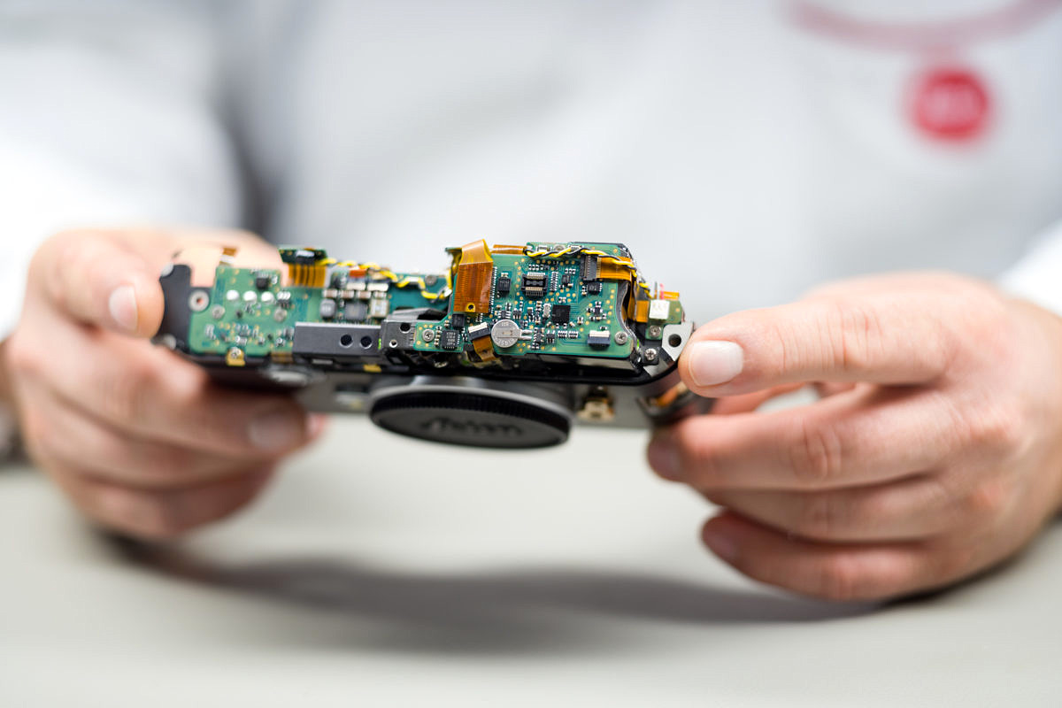
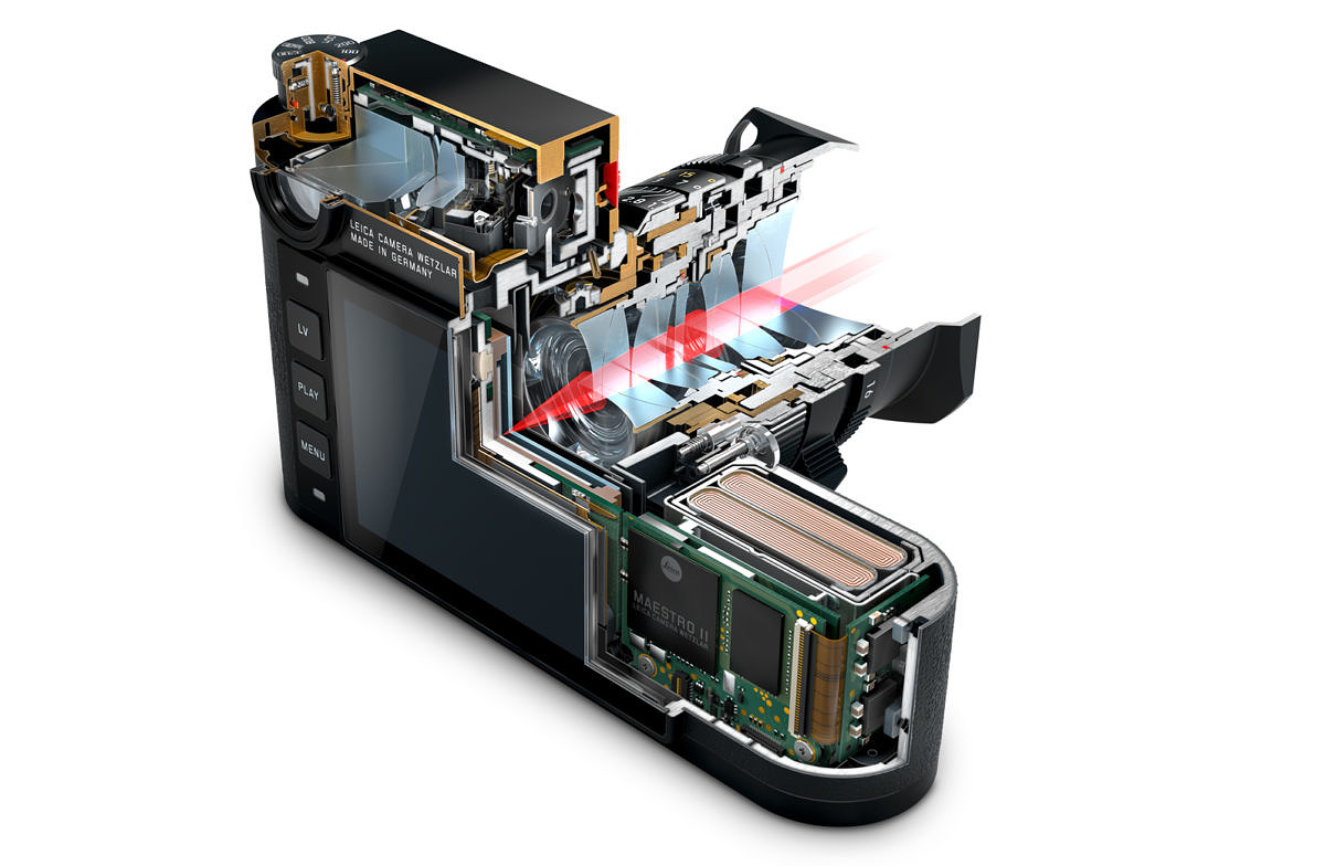
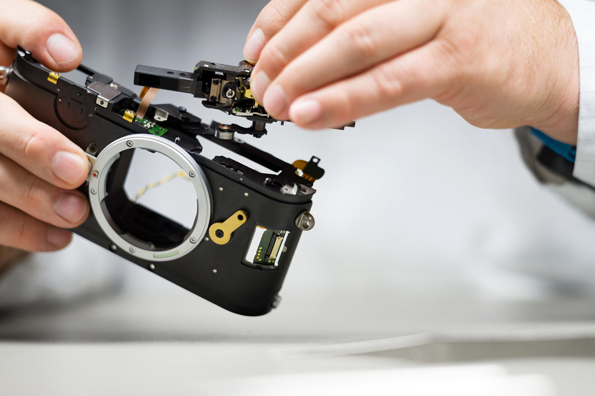
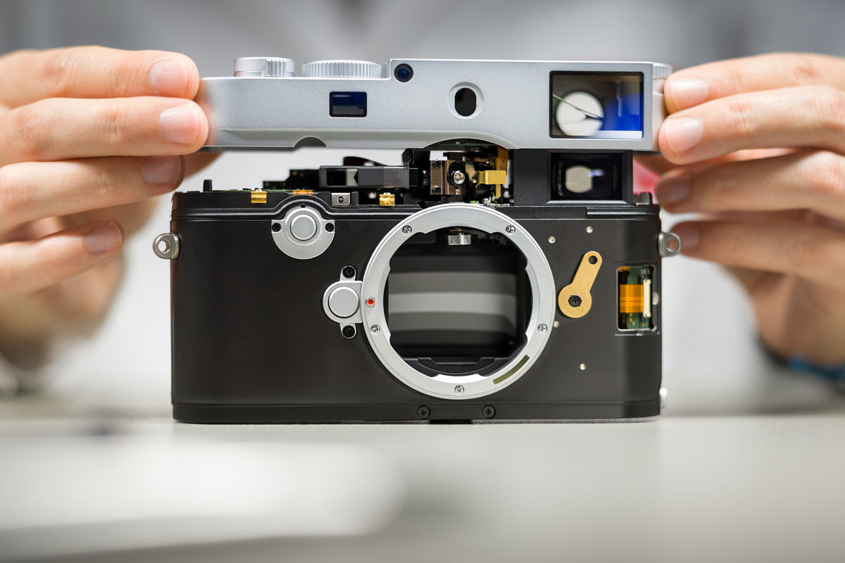
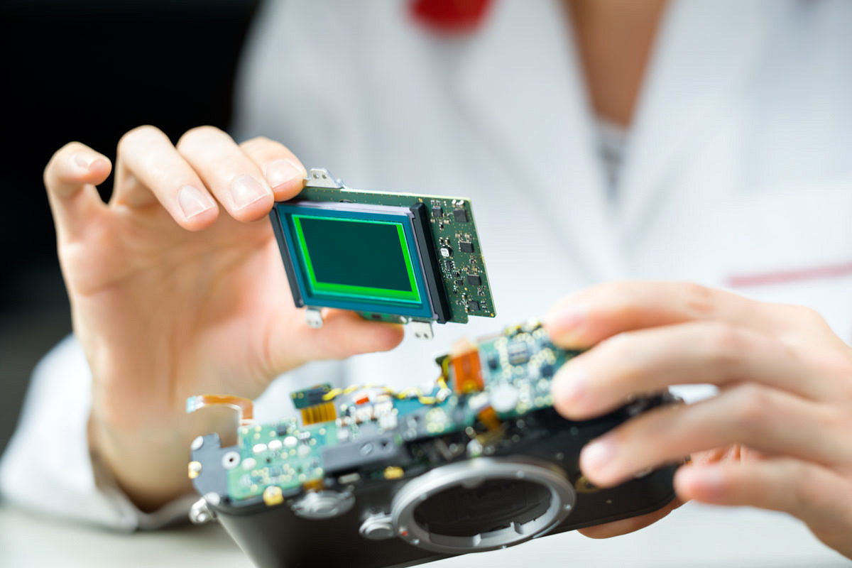
Stefan: It’s not only the lens mount coming out of the camera, though. The entire layout of the electronics has been changed from what is considered normal or standard digital camera design. Typically, you have a shutter, a cover glass, the sensor, a sensor board, the main electronics board, the monitor, and finally, the cover glass of the monitor.
So, it has a lot of depth. How did you address this?
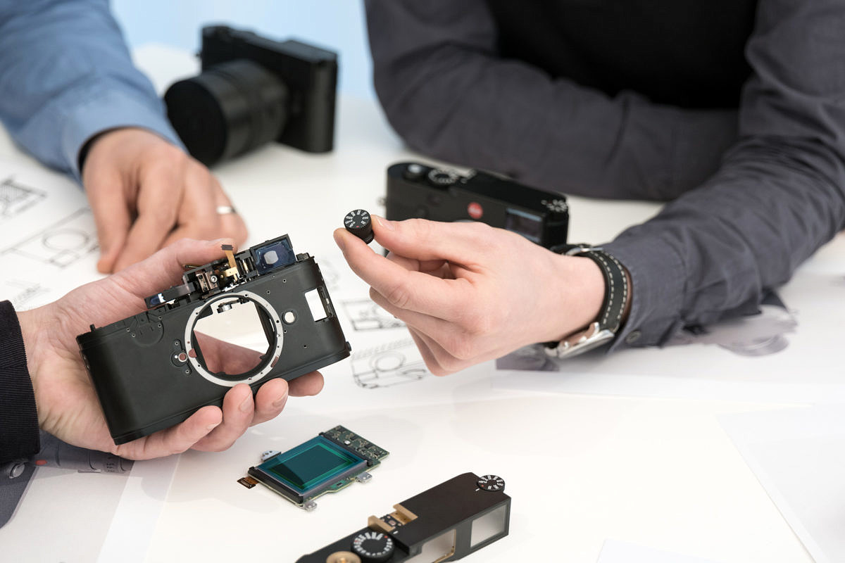
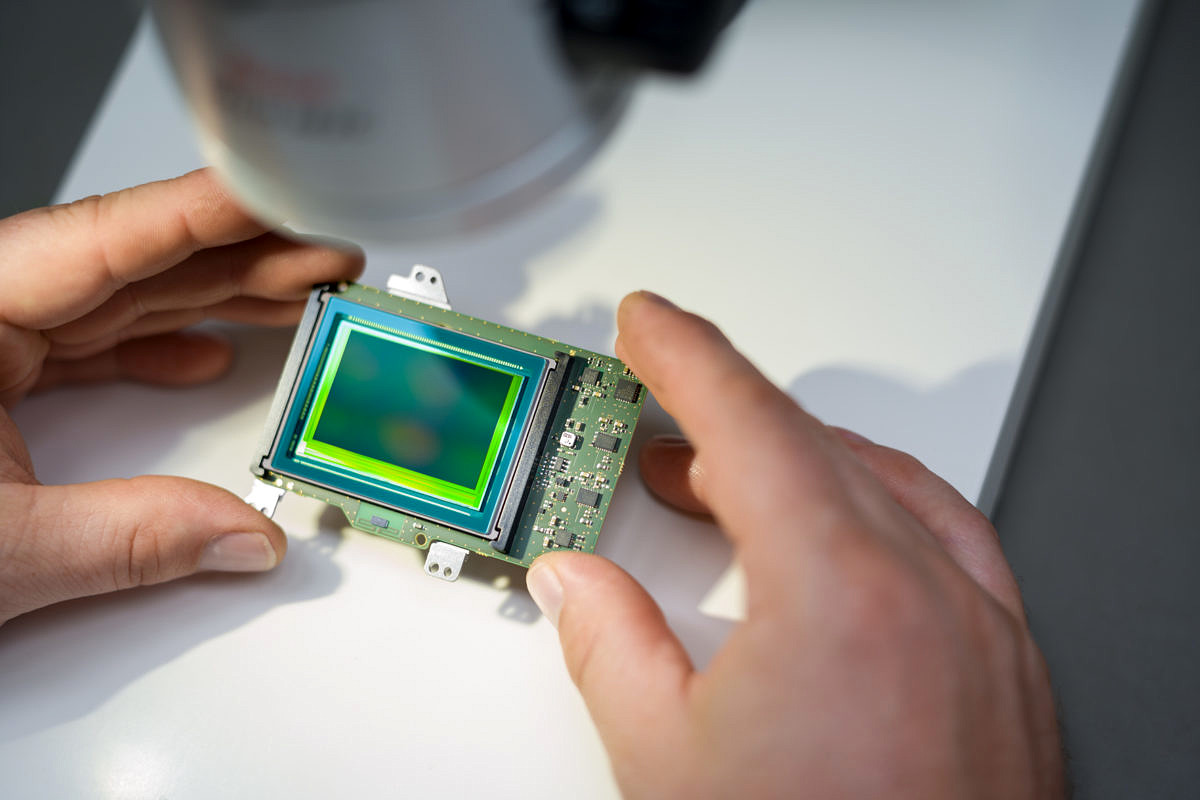
Stefan: Lots of depth, yes. So, to make this assembly thinner, we arranged the sensor board and main board to be on the same level. Not stacked, one behind each other, but side-by-side. Even the main board is around the sensor board.
Does that mean it’s a custom PCB shape?
Stefan: Yes. It’s all custom. You can’t buy that at Best Buy, that’s for sure. This layout is quite unique compared to other cameras on the market.
I played with the camera a lot last night and even after extended use, the camera doesn’t feel warm. I know that a goal of that traditional design, the stacked design, is also to dissipate heat from the sensor, from the monitor, from the electronics. How were you able to get the camera not to overheat and become uncomfortable for the user?
Stefan: That’s the reason we postponed the launch to January – to have a cold environment.
*long pause*
Just kidding, actually. *laughs*
You had me going for a minute there.
Stefan: Look, the point is that if you examine the cutaway picture of the M10, you can see that there’s not much air left inside the camera. It’s really full, full, full – packed. So, measures have been taken on the power management. That is one part to reduce heat. For example, we switch on the sensor only when it’s really needed.
Jesko: It wasn’t an easy task to keep it cool.
Especially keeping the sensor cool, right? Generally, a hot sensor means more noise.
Jesko: Yeah, that’s right. The first prototypes were pretty warm, so we had a lot of discussions about that. But we eventually found ways to keep it acceptable for the user.
Stefan: So, clever power management is being implemented and, on the other hand, having an effective heat sink, a physical heat sink, helps to dissipate heat. The all-metal body and top plate of the camera makes a nice heat sink. So, it’s actually a good sign when the camera becomes a bit warm, because then the heat is going out, not staying inside. But, not too warm, of course.
So, from a hardware perspective, making everything fit in a smaller package posed some challenges?
Jesko: Yes.
Stefan: Absolutely.
It seems you really stuck to your design goal which is to make the most analog-feeling digital M, the purest digital M, and I think this is what M users have asked for a long time.
Stefan: For a decade, yeah.
Pretty much since the M8 came out, I’d say. I think there’s always been other requests on the periphery of that like a hybrid viewfinder. This would be an enormous challenge given the depth restrictions, correct?
Stefan: The greatest challenge would be to integrate the rangefinding function, the optical viewfinder and the EVF panel.
All in the space of 33.7mm?
Stefan: All in this space, yes. And being in every single aspect as good as it would be as a separate solution. And to be quite frank, we had a pre-development project to analyze that and it was a dead end. It would have been a so-so finder, a so-so rangefinder and a medium quality EVF panel. That’s why Fuji is a bit simpler because they don’t have the rangefinder part.
They just have the optical pass-though finder part, not a rangefinder.
Jesko: They don’t have a huge, bright and clear rangefinder viewfinder from the past that they’re being compared with. We learned to never mess with the core of the M. For example, if M 240 was a millimeter thicker than the M9, we felt like maybe this is something we shouldn’t have touched. And, I think touching the quality of the viewfinder would be even worse.
This is sacred then?
Stefan: Yeah, it’s a no-go area.
And you brought back the frame line selector? Again, more traditional M-like.
Jesko: Yeah. We figured out that it’s still popular.
Stefan: More popular than we thought in the beginning of M (Typ 240).
Even before the M10 came out, first with the M262 and then even more so with the M-D262, it seemed like users were asking for less and less features and more and more of that pure M experience – and Leica has been listening.
Jesko: Absolutely right.
And obviously, the M10 goes further beyond the concept behind the 262, but maybe not quite as far as the M-D.
Jesko: Yes. Not everyone is willing to give up the rear LCD, so the M-D is more of a special product. The M10 is designed for a wider audience.
When I picked up the M10 for the first time, it really felt like a pure M experience. The size, the thinness, but also the simplicity of the controls and almost going back to a 0.72 viewfinder [with a 0.73 finder].
You guys could have said 0.72 and no one would know.
Jesko: We could but, why should we? *laughs*
Stefan: It’s even a bit more than the 0.72 finder on the analog side. It’s improved with better eye relief and greater magnification. But to your original comment, that was exactly the goal: to make it feel like an M should really feel. In every respect.
Like it has felt for 60 years prior?
Jesko: Yeah, exactly.
Stefan: Even if you pick up a new M7, or a new MP or M-A, you get that feel of a really handy camera. Of being almost ‘not there.’
An M just becomes part of you.
Stefan: Yeah. An extension of the eye and your hand.
The M10 seems to have a slightly different balance than the 240. More than just a little less weight – It feels more evenly spread out.
Stefan: That’s a nice side effect of shrinking the body. It consolidates the mass.
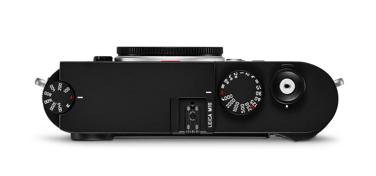
Another big change was the manual ISO dial. Was this part of the design goal to simplify?
Stefan: On one hand to simply, and on the other hand to have every parameter which is necessary for the actual act of photography as a physical control.
Aperture, focus, shutter speed, ISO?
Stefan: Yeah. That’s all you need.
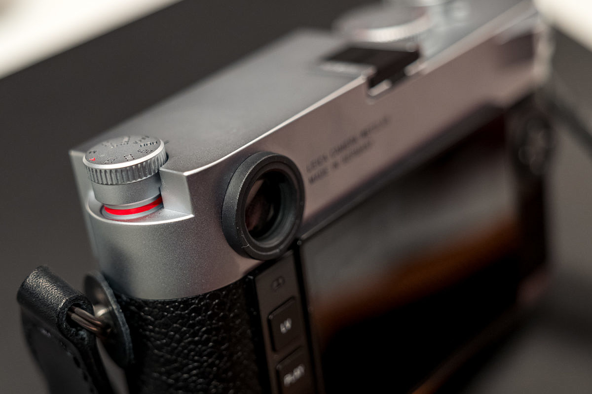
Taking a look at the ISO dial, was it a conscious choice to make it more difficult to change? Is this so that you don’t accidentally alter the setting when you’re putting the camera in and out of your camera bag?
Jesko: Yes exactly. We said before we even had the first sample of the ISO dial that it must be really safe from accidental movement, so somehow our engineers managed to make this two-finger action. With one finger you can’t move it, so it’s near impossible to move it by accident.
I see that.
Stefan: They really succeeded making it safe.
It’s not so bad if you pinch the dial between your forefinger and thumb.
Stefan: Because the worst thing that can happen to a photographer is he’s in a busy shooting situation and the camera is set to a wrong ISO, he doesn’t recognize this and he misses a series of shots. This is quite an exposed position, at the edge of the camera body. If you put it into a camera bag it could turn accidentally, so that was the design goal to make it really safe.
But it works either in the “up or down” position, right?
Stefan: Yes. You can also use it in the extended position
So, if you’re working quickly in changing light, you can leave it up. And then it’s just one finger.
Stefan: And if you also have it up to your eye it will display the ISO setting in the finder as you move the dial.
I noticed that, in the finder. Did you increase the digits maybe?
Stefan: No it’s the same.
Jesko: It’s always fun to find new functions that work with relative low number of digits. *laughs*
Stefan: But I think we’ve almost squeezed everything out. *laughs*
Jesko: There’s still possibilities!
It’s nice. You’re looking through and you can actually see it says 800, 1600, 3200 and the dial isn’t so easy to accidentally move. There’s nice detents in it, which I think is very clever. And the rear thumb dial on your right thumb can be set to direct EV compensation just like the 240. So, now you have all of the essential controls if you’re shooting in automatic.
Jesko: Yeah, that’s correct.
And the EV compensation is also very difficult to move accidentally, especially If you have the thumb grip attached.
Stefan: Yeah, you shouldn’t be able to move it with a thumb grip without willing to do so.
And the decision to eliminate video? What was the thinking here?
Jesko: We talked a lot to our customers to find out what the essential requirements for the new generation were. And when we talked about video we found out that most of the customers said, “I don’t care.” Many costumers said “I do care, but I don’t want it.” And of course, there’s a certain group of costumers that really appreciate video and would miss it, but these are customers that would really want it working perfectly, with HDMI and more advanced features.
So therefore, we have the SL as an option for them. When we developed the M (Typ 240) we didn’t have an SL so we tried to reach a broad customer group, which we still can reach now. But with two different products, which makes sense from a product development standpoint.
And with the SL, you can still use M lenses for shooting video, if that’s the goal.
Stefan: Yes, of course.
Tell me a little bit about the more simplified button interface on the back of the camera.
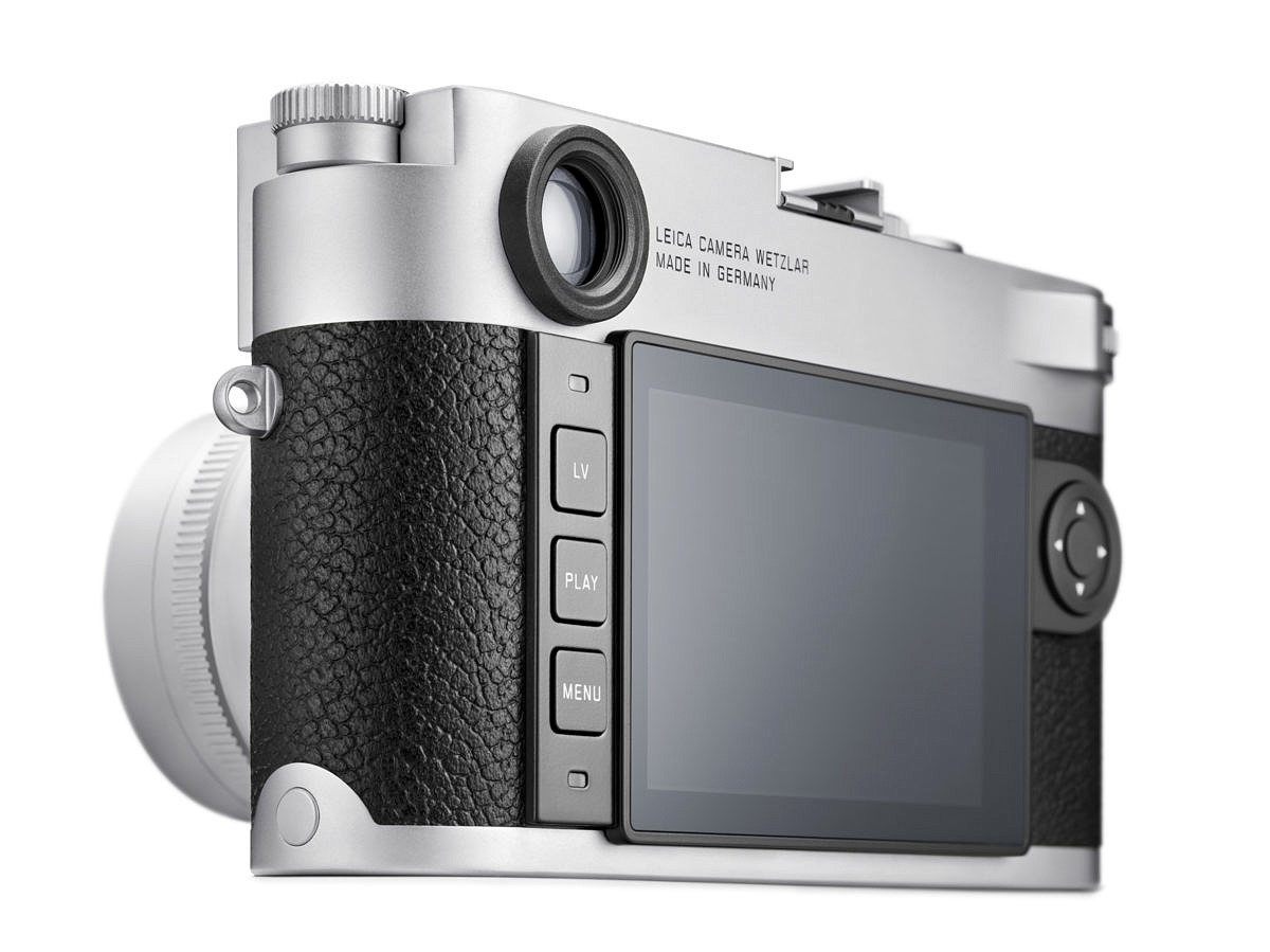
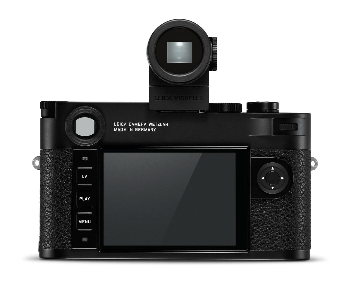
Jesko: Our target was to simplify the camera as much as possible in order to make a pure M. So, we also looked at the digital side of the camera to see how we could streamline it. Reducing the number of buttons makes the operation easier to understand. You don’t have to read each button label since there are only three, and ultimately, you’re faster at accessing all the options available.
But we didn’t want to create more work for the photographer, so everything that was there with the six buttons can still be reached with the same number of clicks with this concept. We’ve found it’s very easy to learn the new concept.
It’s definitely easier when you’re using the camera. I found that I didn’t need to look at the buttons. You’re aware that there’s three and you can very easily hit the center button for playback or the top for Live View.
Stefan: Yes exactly.
Jesko: Many users were never able to remember the position for six different buttons.
Right. This seems a little more straight forward and the buttons are also larger so it’s easier to press without looking.
Jesko: I assume you already checked the favorites menu function?
I did. It comes up when you first hit the bottom menu button. This concept was introduced on the SL, correct?
Jesko: Yes. We have adopted it from the SL.
And also the T.
Jesko: Yes. The T had the same philosophy, but in a different GUI. I think that’s something every Leica camera should have because the needs of customers can be different. It’s important to have your personal, most important settings with quick access. So, this is a much better SET menu than we had in the past.
I routinely use the Favorites menu on the SL. It’s nice because you don’t have to go through pages of options every time. You just set your most important, most often used settings.
Stefan: We would have liked to have no menu at all, but we figured out we can’t live without one.
Isn’t that what you did with the M-D?
Jesko: Yeah, that’s an M-D. So maybe that’s a little too special, but the philosophy behind it is you can live without a menu once you set your camera to how you think your camera should behave with certain settings, which you don’t touch on a daily basis.
And that’s up to the individual?
Jesko: I only use my personal favorite menu setting and that’s it.
I also noticed the simplification of the power switch. Same thing, same philosophy, right? Reduce to the essentials?
Jesko: And to get as close as possible to the analog workflow, yes. Really pure.
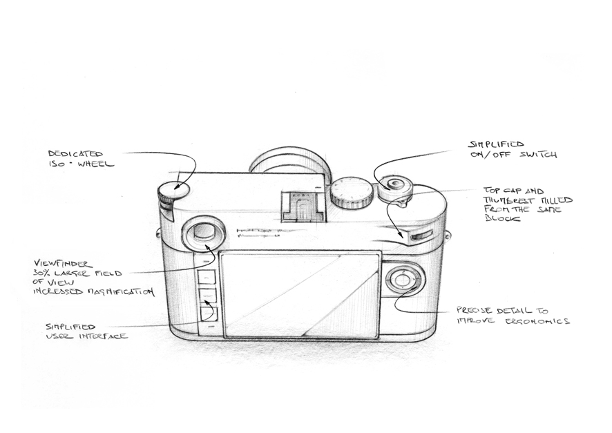
A film M just has an on and off for the meter. This is very similar to that design.
Jesko: Absolutely. We received feedback that it was too easy to accidentally move the three-position power switch on the M240 to continuous or self-timer. So, we streamlined the control and put the other advance options in the menu.
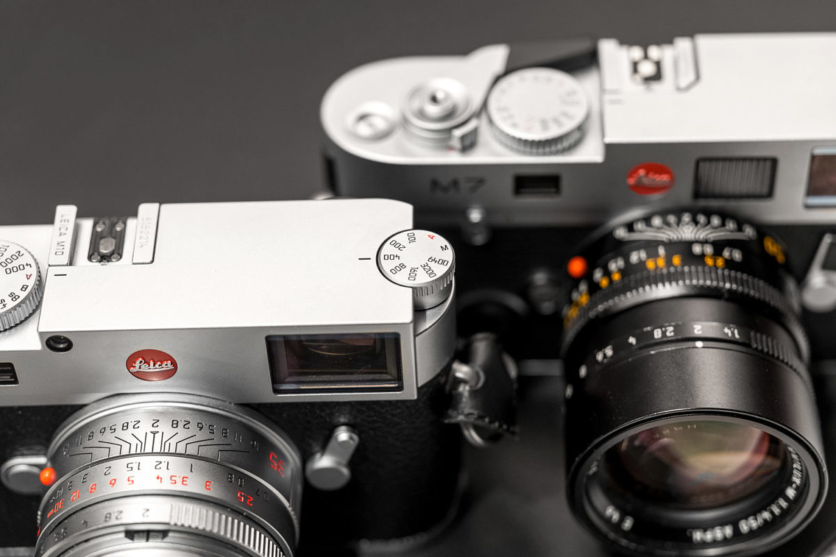
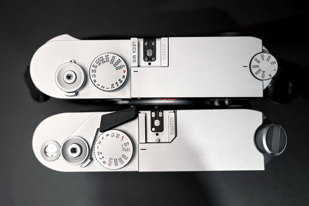
Last night we were comparing the M10 to the M7 and even the placement of the shutter speed dial and shutter release match up. The rewind lever corresponds to the ISO dial. The dimensions seem almost identical if you overlay the two cameras. Did you use the M7 as a design template for the M10?
Stefan: In terms of the thickness, of course. And also the M7 on/off switch is quite a nice set up. Same position, same shape so that was kind of an inspiration, of course.
I notice the viewfinder is noticeably larger than even the M7 viewfinder. Is this a completely new design for an optical M viewfinder?
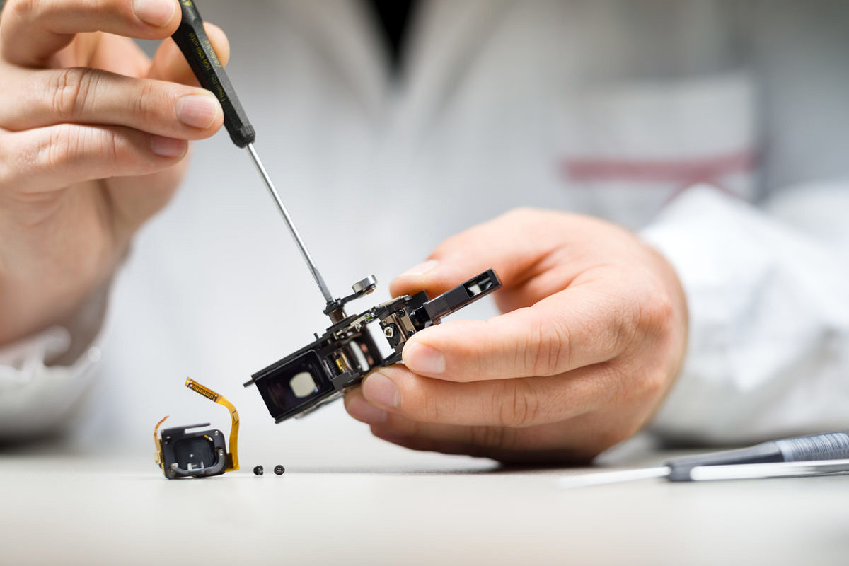
Stefan: So the basic layout, the core principle, is the same as almost every Leica M built. Only the M3 had a completely different layout. But for the M10, everything was reworked: the prisms, the coatings, the optical calculations for the distance measuring path has all been revised. It has been mechanically re-engineered to give better stability, better precision, and the windows in the front and the rear of the rangefinder have been enlarged to create a greater view.
Yeah, it’s really nice. I wear glasses so I can’t really see the 28mm frame lines without moving around, but no matter how much I move, I can’t even see the edges of the frame. It’s almost like an infinity viewfinder and very pleasant to look through, for sure. Very welcome for eye glass wearers because it fills your whole field of view with even greater eye relief.
Jesko: This is probably the nicest optical viewfinder we’ve ever made.
Let’s talk a little bit about accessories. There’s a little more integration now when you look at the handgrip for the 240 vs. the new handgrip for the M10. It almost feels, when you attach it, that it’s part of the camera. The combination feels like one unit.
Stefan: That’s the goal, yeah. To make it one single unit. Especially if you put the thumb support on the rear together with the hand grip. This really feels like the camera is becoming sticky in your hand.
Jesko: Also, we now have both a silver and black finish, rather than just black. So, when you attach the matching finish handgrip, the result is very nice.
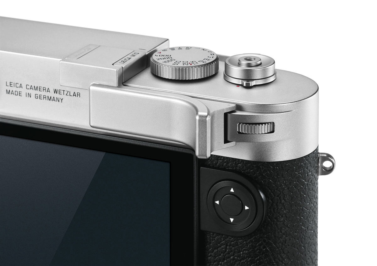
You guys have come out with a new thumb rest. And the thumb rest is designed so that it’s cradling the rear thumb dial. I’ve got to say that it’s really very solid with no wiggle.
Stefan: The thumb rest was designed with the camera.
Jesko: The new thumb rest makes the handling of the M even better. I use it all the time.
And it has the exact same finish?
Jesko: Yes, of course. It’s made from machined brass which is then silver chrome plated or black chrome plated to match the camera finish exactly.
Exactly the same finish. So, that’s a nice match. I also see it has a rubber backing.
Stefan: Yes.
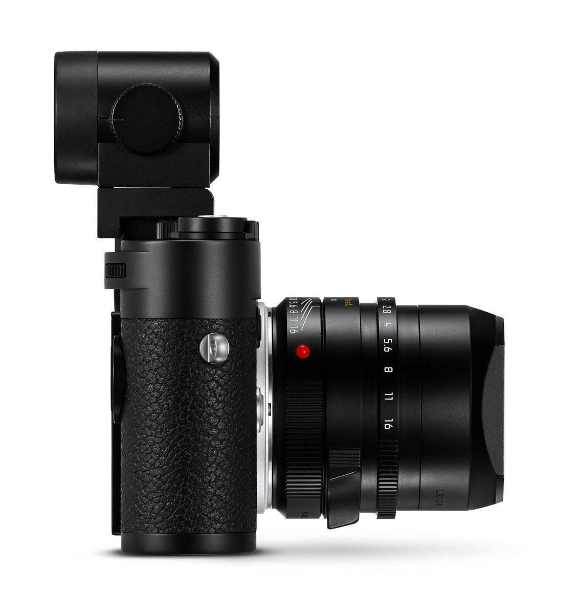
Clearly, a decision was made to use the existing Visoflex 020 on the M10 that was used on the T and the X113. What was the main reasoning behind using this finder rather than develop a brand new one?
Stefan: The point is, we said okay, what should the resolution be? What shall be new on this finder? What can we improve? And then we found out that maybe there’s not that much to improve, because for an auxiliary finder the magnification in the current Visoflex is very high and the panel is absolutely state of the art, even if it’s now from 2014. So, we decided to keep it and to be honest there’s a bit of R&D money saved by not developing one from scratch. A lot, actually. So, this made the most sense for us.
The EVF in the SL is still best in class. Did you consider adapting this finder into an external unit?
Jesko: But this would have been huge to put in an accessory.
Stefan: Look at the size of the eyecup of the SL. The panel itself is a huge thing, especially compared to what we have in the Visoflex, and already that is not such a small finder.
I see. It’s not just the raised section on top of the SL. It actually extends further down below the eye cup. So, really, such a finder might be the size of, let’s say, a Zacuto motion picture finder. They’re big OLED panels with massive eye cups and metal fins to dissipate heat.
Stefan: It’d look really strange.
Jesko: I don’t know what’d they’d be called since the “Frankenfinder” already is a Frankenfinder. Maybe that’d be even more. *laughs*
Stefan: Frankenfinder 2.O *laughs*
I see where you guys are coming from. Honestly, I think the finder is fine. I’m accustomed to it from T and you get the added benefit that it has the GPS function without having to have that in the handgrip. This is a nice touch. Too bad you can’t use the thumb rest and the EVF at the same time.
Stefan: That’s really too bad, but we only have one hot shoe.
That’d be a real engineering challenge.
Jesko: I love the thumbs up and the thumbs rest. So much that I never use the EVF.
Jesko, you really are a purist.
Jesko: Absolutely! M all the way.
Are there any plans for a silver color Visoflex since all the other accessories now match for silver?
Stefan: As it is, it needs to be plastic because otherwise the GPS antenna wouldn’t work. Silver painted plastic is kind of a no-go because it then pretends to be metal, but it’s not. This looks like plastic and it is plastic, so if something looks like metal, it should be metal.
Let’s talk about the sensor and electronics. This is a newly design sensor. I know there was a lot of speculation that it might be a version from the Q or the SL, but I hear this is not the case.
Stefan: That’s correct, yes.
So the sensor is a new development?
Stefan: You know, to get the very best out of M lenses you need to follow certain rules in the sensor design which are special to M. And this is exactly what we did. As we did for the first digital M, we matched the sensor to the lenses. And that is the case here so it’s not just borrowing from the Q or SL. Nevertheless, the performance is on the same level or maybe, as it is a bit newer design, even a bit higher. It’s a sensor being exclusively designed for the M and it will not go into any other Leica or any other kind of camera.
Exclusive to M10? You talked about the sensor being made for M lenses. The M8 and M9 sensors had offset micro lenses towards the edges. The M240 went with a new conical micro lens design to catch the high incident angle light and focus it into the pixel well. Does the M10 sensor use one of these approaches?
Stefan: Yeah, we used similar techniques, but the M10 sensor is a more refined version using the latest technology and pixel architecture.
Did Leica have a hand in terms of designing that micro lenses structure?
Stefan: Yes, a big part.
How is the corner performance in terms of any kind of color shifts?
Jesko: That’s kind of behind us because we calibrate all the color performance for every lens. We already did a very good job on M (Typ 240).
The M240 was definitely an improvement over the M9.
Jesko: Yes. We improve from generation to generation, but I think there’s nothing that had to be improved compared to M 240 from the end users’ results. But I can tell you if you’re interested. If you look at the RAW files, the uncalibrated RAW files, from certain lenses that are critical, they have much less color shift or other issues, so the sensor is really solid. For users, it’s still interesting if they use Voightlander lenses for example. They might be much more usable now with this camera.
Stefan: Maybe we shouldn’t say that… *laughing*
Improved ISO performance has always been a prominent request from users. Every single generation we want more and more low light performance. I took some sample pictures last night and have my own opinions, but I’m curious to see what your feelings are in terms of the improvement from the 240.
Jesko: We say 2-3 f-stops. I’d compare 1600 on the M (Typ 240) to 6400 on the M10. I think that’s about equal.
Stefan: You get a fairly usable 6400. And with a bit of post-processing, you can even go higher. Also, we’ve reduced the number of artifacts and banding, issues which might have been at the very high ISO settings on the M (Typ 240), so that’s also a big improvement
I think you might be even a little on the conservative side from what I’ve seen so far. ISO 6400 looks great, but I would be willing to push a little further.
Stefan: I think it’s a significant improvement. And, once again, I think a point we cannot stress enough is that our cameras might be, at first look, a bit nosier than others. But, the philosophy of Leica is always to keep resolution, because noise can always be removed. And if the resolution is lost in the file, you cannot re-create that.
So no aggressive on chip noise reduction like other manufacturers do?
Stefan: It’s part of our DNA, I would say, that we don’t do that.
I appreciate that because the reality is that you’re looking at such a high-resolution image, and you’re looking at it at 100% on your monitor. It’s a little noisy, but you make a one meter print and then you don’t see it, because print doesn’t translate from screen 100%. I don’t know if people understand that.
Stefan: That’s why we keep arguing on that.
And the decision to stay at 24 megapixels? Perhaps more specifically, the decision to stay at a 6 micron pixel pitch on the sensor, like every other full frame, and larger than full-frame, Leica camera right now. Was this a conscious decision?
Stefan: No, it was totally random. *laughs*
I should rephrase. What was the logic behind the decision to stay at 24MP and/or 6 micron pixel pitch?
Stefan: Because with the technology we have at hand, as a proven technology, the feedback from users where they say “Yeah, I’m totally fine with 24 megapixels. More pixels just blow up the size of the file.” So, we don’t really need more and it’s the best compromise between low light sensitivity and resolution, at the time being. At least in our opinion.
People think smaller pixels are always better because this results in more resolution, but as is, 6 micron pixels are diffraction limited to f/11. And if you get smaller and smaller pixel sites, suddenly you now must shoot everything f/5.6 or f/8 minimum, which sacrifices real world usage by limiting depth of field. Is this limitation considered, or is this merely a byproduct of other factors?
Stefan: That all plays into the decision. File size, low light sensitivity, diffraction. So, we’re totally convinced it’ll make its way with 24 megapixels.
I think the response has been fine. Just as it is with the SL and the Q, everything with 24 megapixels seems to be a nice sweet spot for resolution.
Stefan: Leica is addressing people who are maybe a bit more advanced in photography in general. Maybe in America because “more is better,” but people who have experience know that it’s not just marketing blah-blah defending what we have. At least for the time being. No one says we’ll stay forever and all days with 24 megapixels.
Like the M240 introduction, we got a little more speed. The M240 was about 3 frames a second and now we are moving up to about 5 frames per second with the M10. Beyond the frame rate, it definitely feels quicker overall. Is this a result of the sensor, the Maestro II processor, or is it a combination of everything?
Jesko: Mostly the processor. I’m not sure if the M240 sensor would have made 5 frames, maybe – maybe not. It’s mostly the processor. The Maestro II processor helps a lot and there are some other improvements as well.
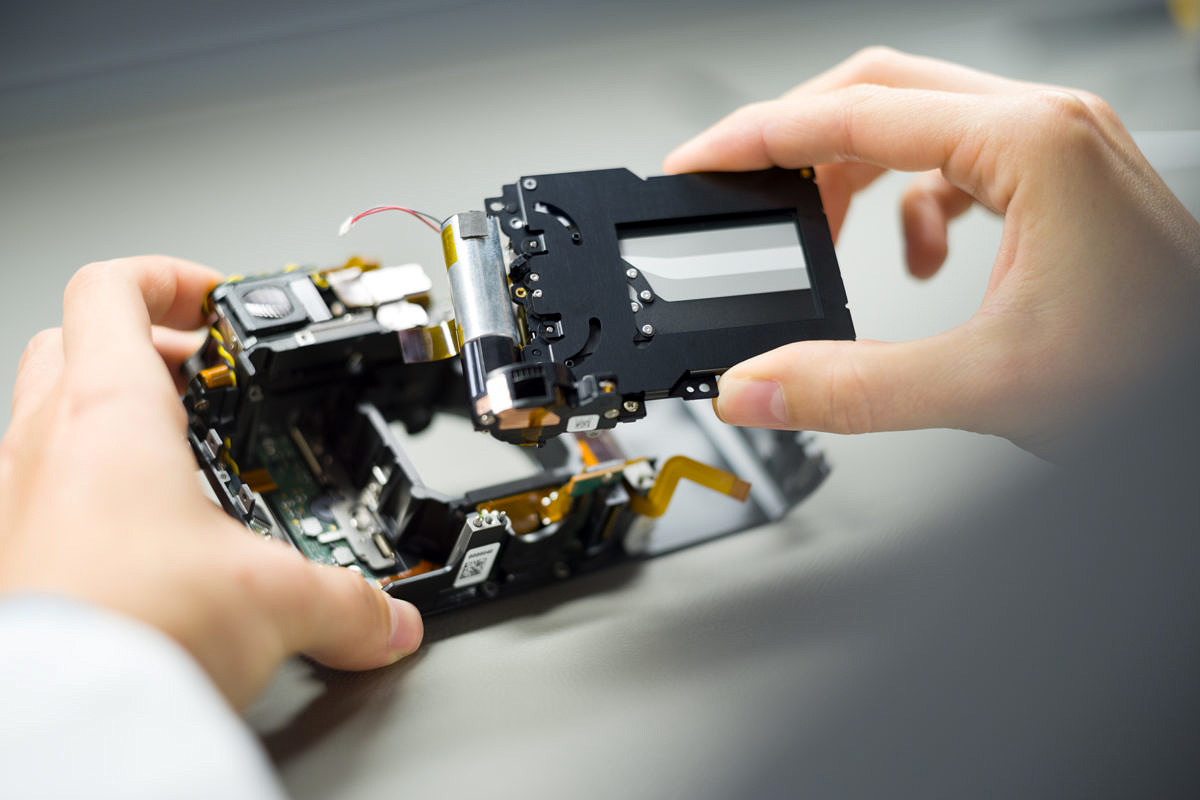
Stefan: Also, the shutter is now able to cycle faster. This makes a big difference for frame rate.
Is it not the same as the M240 shutter?
Stefan: No. The shutter is a new development as well because it’s another challenge for the thinner body. So, the shutter has been reduced in size. That’s, by the way, the reason why the M10 doesn’t do 11 frames per second like the SL. It could, based on the sensor and the processor, but the SL is a much larger camera, meaning it has more space for the shutter and the shutter drive unit. Here, the goal was to have the most compact camera.
And the Q can achieve that speed because it has a leaf shutter that’s very small?
Stefan: Yes, exactly. So, that’s a different game. And by the way, 5 frames per second for M is really a lot. More than most people need.
That’s faster than any film M.
Jesko: Absolutely. We had a motor for film Ms. How fast was this?
Stefan: 3.5 frames.
Jesko: That’s really fast for analog times.
You said that the sensor and processor isn’t the limiting factor. Is the refresh rate limited? Because I was noticing in the EVF that the responsiveness isn’t quite at the same level as the SL, which I believe is 60 fps.
Jesko: This can also do 60 frames per second .. or possibly 120. I think the 60 frames per second is not directly related to refresh responsiveness. If you do the hand shake test I don’t think that’s the answer for 30-60 frames. I think that’s related to the lack of time delay that could be there.
Stefan: The panel itself is a bit limited, but as this is not the main finder most will find it perfectly acceptable.
Correct. This camera is pure M. The EVF is for convenience.
Stefan: If you do a macro shot or use a 280mm R lens or something like that, the EVF is extremely useful.
I still think this is a big improvement from the EVF 2.
Jesko: It’s a big improvement, absolutely. It’s the resolution and the size of the frame, yes. But, perhaps the most important improvement is the blackout time after the shot. It was 1.5 seconds on the M240 – which was way too long to refresh. I think it’s a third on the M10 compared to the M240, so it’s a major improvement. And you can now shift the view magnifier, zoom in on any area in the frame, which wasn’t possible before.
I think I know the answer to this question but I’ll ask it anyway. On the Q and the SL, I love the touchscreen interface, especially for selecting focus points as well as for quick zoom to check focus and move around while zoomed. It sounds like a gimmick when you first hear about it, but when you actually use the camera, it’s awesome. Is the choice not to have a touchscreen on the M10 one of keeping it more of the essential experience, with completely analog haptics, or is it the depth restriction? Or all of these?
Stefan: It’s more about keeping it pure and not adding too many hidden functions in the whole camera.
Jesko: We didn’t want to do everything that’s technically possible for the M10. And from our survey, a touchscreen was also rated very, very low as a desired feature.
Stefan: It may change as touchscreens are being so widely used now, not only on cameras, but everywhere. So, it might happen one day. We cannot exclude that possibility, but for the time being, we’re quite happy to have it like this.
One last question. I feel the “no comment” coming, but here goes. Obviously the Monochrom 246 has been a huge hit. Everyone loves it. Any future consideration for making a Monochrom version of the M10?
Stefan: *laughs* Of course, yes, consideration. The point is, as we had for the M9 and the M Monochrom first version, which was sold in parallel to the M240 for a long time, this will be quite similar here. So, the M Monochrom second generation will be there for a while alongside the M10.
Alright that wraps it up. Thanks so much, guys!

David,
An incredibly through interview.
You touched on some items that I had not gleaned from other reviews.
Glad you asked about the eventual mono.
Thank you.
Very nice, David!
Enjoyable read with lots of detailed information.
This was very informative, especially where they get into the continued differences between the M10 sensor and the SL sensor. It appears that there may always be lenses that are more appropriate to one or to the other. After some of the experience with the SL and formerly “tricky” lenses which had gotten recently re-issued, I suspected that the SL was a new standard. For example, does the new “vintage” Summaron 28/5.6 give a nicer overall image on the M10 than it does on the SL? (There must be a way to answer this tactfully?)
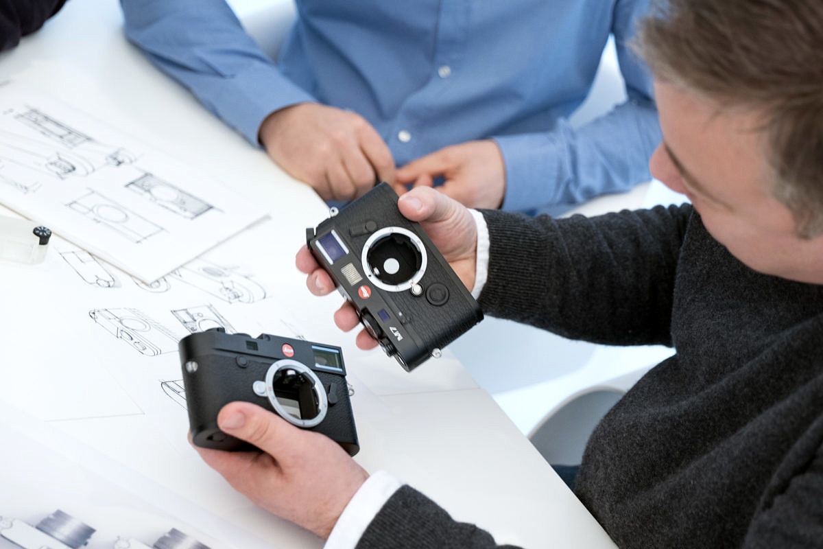
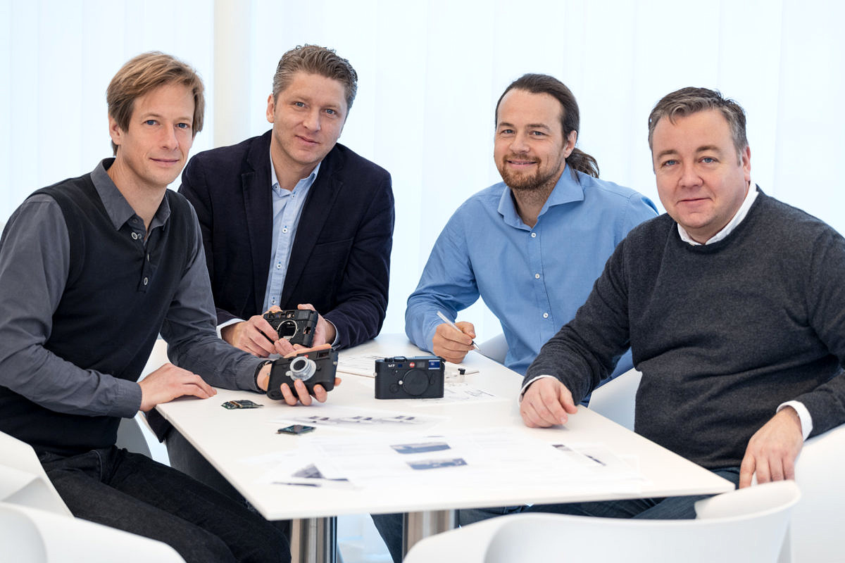
And we’ve seen Stefan and Jesko before, but who are the other two guys in the ;picture partway through the article?
scott
Very nice interview, with lots of information. I hope this answers many people’s questions about EVF, touch screen, video etc. I’m glad that although they are listening to their customers, they are trying to keep the M close to the original philosophy as much as possible.
It’s just a marketing schpiel. That’s all. Smoke and mirror tactics. No video because it’s too cramped and will overheat. No increase in pixel count – and saying anyone with experience know’s it’s not important is insulting to their user base because that is totally untrue. You can’t even tether the M any more, that was once a very usable feature for “those with experience”. No spirit level anymore. Greatly reduce battery life. Leica ruined the M. They killed it off. The M is dead.
Fred,
For many M users, the M10 is the penultimate digital M, the one they’ve been waiting and dreaming of since the M8. Leica took user feedback into account when designing the M10. The top request was for a thinner body, with the same dimensions as a film M, and they delivered. Second most requested was an improvement in low light capability. The M10 shoots cleanly at ISO 10,000 with great color, where the M240 topped out at ISO 3200. For most users, lower noise, better color and increased dynamic range trump pure pixel count.
The M10 also has a significantly improved optical viewfinder, a direct ISO dial, reduction in UI clutter, improved LV functionality, faster processing speed and frame rate. All around, the M10 is a natural evolution from the M240. It has a slightly smaller battery, but also more power efficient processing. On the M240, I carried two extra batteries for a full day of heavy shooting. I do the same with the M10.
The omission of video wasn’t due to heat. If this was the case, Live View would have been eliminated, as reading out for LV puts the same demands on the sensor and heat dissipation mechanisms. Video was taken out because the vast majority of M users didn’t want it there. They complained vehemently of video ruining the pure M experience on the M240, and such an incredibly small percentage of M users ever used it. The concept of the M10 was to get back to basics, the essentials. Not marketing schpiel, but rather a company-wide mantra. Every product manager strives to this standard.
I’m not saying that some users didn’t appreciate video, or tethering via the multifunction grip, but Leica responded to the 90%+ of users who flat-out rejected these features as un-M-like. For those who want to tether or shoot pro level 4K video, and have the option to use M lenses, Leica offers the exceptional SL. This is the idea. M10 for the purists. SL for those requiring a professional feature set.
I’d recommend checking out my full review on the M10 here. It’s a fantastic camera to shoot with and the image quality is phenomenal. And, yes, I’m ok with 24MP, both on the M10 and SL. A 6um pixel size allows for stopping down to f/11 before hitting diffraction, and I have a stack of 24×36 inch prints that look incredible from nose-in-print distance. If the need arises, you can certainly print bigger and maintain gallery quality output, but again, most M shooters don’t want or need to print this large. Will Leica ever increase the pixel count? Maybe, but only if there they can do so with no sacrifice in image quality, DR, low light ability or edge-to-edge performance.
Go out and shoot with the M10 and you’ll see that the M is far from dead. Quite the contrary, actually.